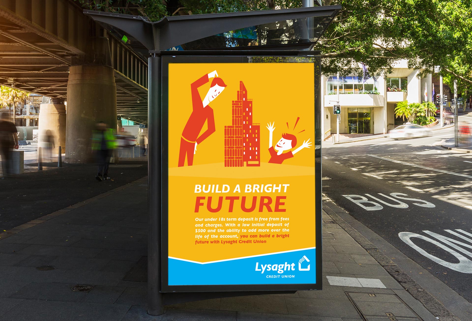
Working through the brief with the client the top request was not to utilise photography as the primary imagery, from this an illustrative approach was developed. I took the deliberate action of breaking with the existing Lysaght Credit Union’s brand colours.
Lysaght Credit Union
By using colours complimentary to the brand it made both the poster content and the logo stand out, The bright yellow and red colours made the posters stand out against the environment when displaying to their target audience; engineers at the Wollongong Steel Works. Each round of posters alternated the dominating background colour. By revolving the colours in this manner we maximise the effectiveness of the posters – the audience does not become colour complacent. The audience is more likely to notice when the poster changed as the colour within the environment changed.
Client
Lysaght Credit Union
Studio
121 Creative
Role
Creative Direction, Designer, Illustrator