Client: BlueScope Steel
Role: UX and Product Designer
Platform: Web-based resource and guidance platform
Scope: Research, design strategy, UX/UI design, content architecture, MVP and future state planning
Designing Confidence in Light Gauge Steel
Frameworks was created to solve a strategic problem: despite the strength, sustainability and precision of light gauge steel (LGS), many builders, tradespeople and educators hesitated to adopt it. The barriers weren’t necessarily technical, they stemmed from a place of unfamiliarity. The sense that steel was hard to learn, time-consuming to master and riskier than timber.
The solution wasn’t to market harder. It was to support better.
BlueScope Steel needed a platform that could lower the friction. One that would make product information genuinely accessible, not just available. A place where a user could come to understand how to work with light gauge steel and walk away feeling confident, safe and informed.
There was also a hard constraint. For legal reasons, the platform couldn’t be called a learning tool. That meant no formal modules, no “training” language, no suggestion of accreditation or qualification. The content had to function like a structured learning experience without ever presenting itself as one.
This tension created an opportunity: to design a platform that felt natural, modular and easy to navigate, using the best of learning UX without the institutional baggage.
Client Background
BlueScope Steel is a leading steel manufacturer in Australia and across the Asia-Pacific region. Known for products like COLORBOND® and ZINCALUME®, they serve industries spanning construction, infrastructure and manufacturing. With a global workforce and deep technical expertise, BlueScope is trusted across the supply chain.
But in the residential and small-to-medium construction space, even high-quality products can struggle to gain traction if people feel unsure how to use them.
BlueScope had a wealth of information, but much of it lived in traditional formats: technical manuals, compliance PDFs and manufacturer spec sheets. The knowledge was there, but the format made it hard to access, especially for time-poor workers on site or students trying to learn independently.
The Brief
The task was to build a digital platform that could help users understand how to build with light gauge steel. Not by simplifying the material itself, but by increasing its accessibility.
The content had to be accurate, compliant and detailed. But it also had to feel achievable.
The platform needed to serve a wide audience, including:
- Tradespeople and subcontractors who needed practical, on-site guidance
- Business owners and project managers who were weighing risks and materials
- Students and apprentices learning the basics of construction
- Trade educators looking for a more engaging way to teach best practice
The ultimate goal was to make the use of light gauge steel feel accessible, safe and second nature.
The challenge was perceptual as-well-as technical. While light gauge steel offered clear benefits in terms of durability, speed and sustainability, it also came with persistent concerns. Builders concerned about higher upfront costs, thermal and acoustic performance, and how steel would behave differently on site. Many simply preferred to stick with what they knew: timber.
There was also market inertia to consider. Timber had long been the dominant framing material in residential construction, and with that came a deeply ingrained set of habits, expectations and supply chains. For many users, light gauge steel felt unfamiliar, harder to access and harder to trust.
Creative Direction
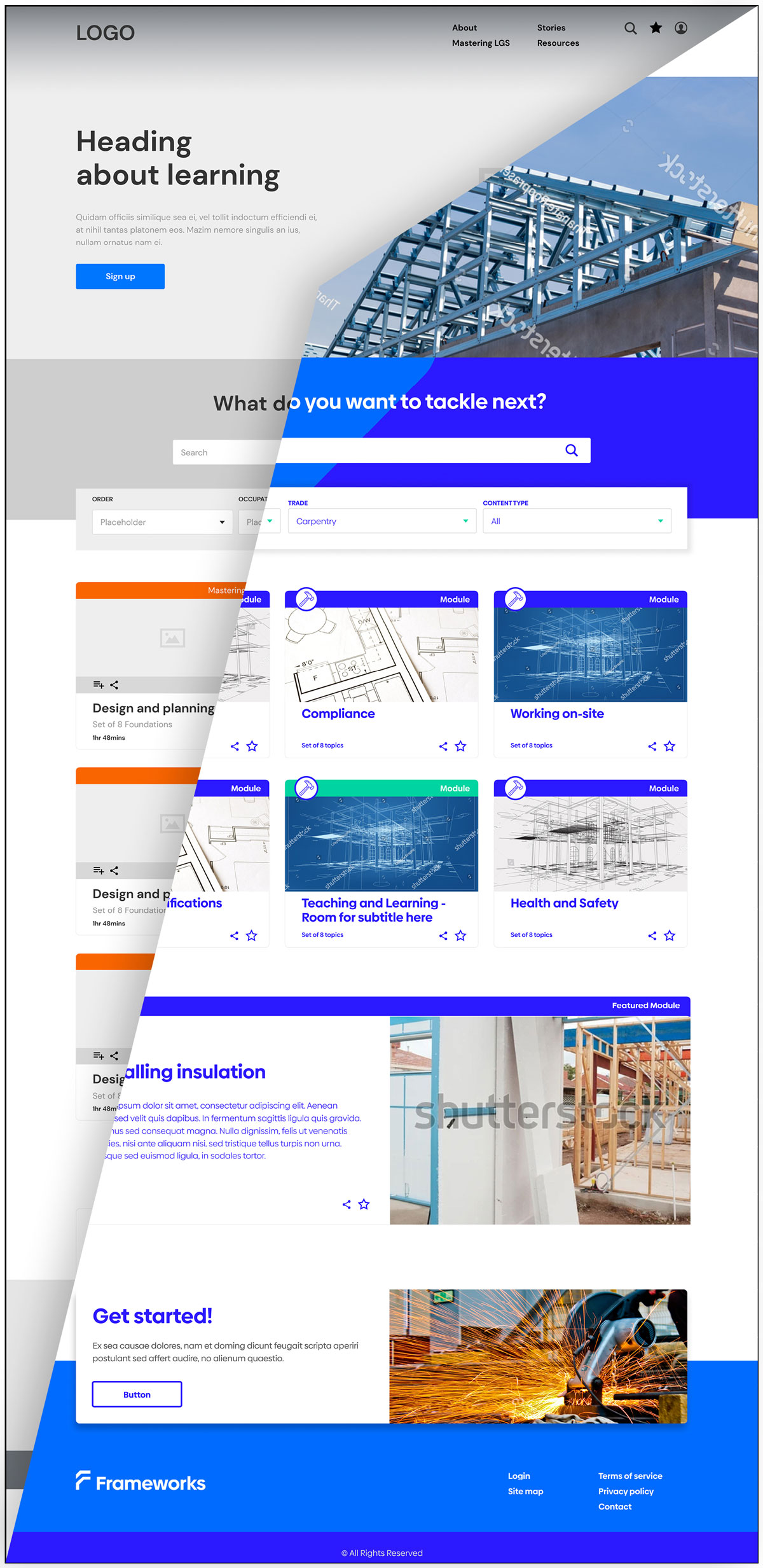
The core design idea was to reframe dense, passive content into modular, interactive, role-specific resources.
Instead of asking users to download and digest extensive PDFs, the platform broke down information into smaller, focused segments. These were grouped into topic-based clusters that resembled learning journeys but were presented as self-guided ‘Master Sets’ and ‘Foundation Subjects’. This shift in naming preserved the structure of a course without implying formal instruction.
Progressive disclosure became a key tactic. Users were given enough information to act, but not overwhelmed. Each screen or module focused on a specific outcome or topic. Completion tracking and next-step prompts encouraged movement without demanding it.
Personalisation also played a major part. At entry, users could self-identify their role. A carpenter would see content relevant to fixing and framing, a project manager guided toward compliance and risk-focused material. For those who chose not to self-identify, filters and search allowed for manual exploration.
The goal wasn’t to oversell steel or gloss over its complexities. It was to acknowledge those concerns and offer clarity.
Common hesitations, such as those around thermal performance, acoustic transmission or initial cost, were addressed through plain-language explanations, supported by diagrams and expert-led videos. The platform didn’t avoid complexity, but it organised it. It gave users the tools to make informed decisions, not just to absorb information.
By structuring the platform around real-world concerns and user priorities, Frameworks shifted the narrative from “why steel?” to “how steel works for me.”
Design and Build
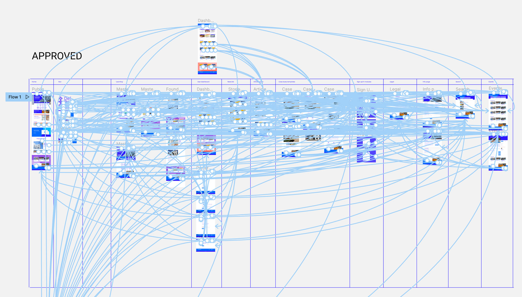
The design process started in Sketch, with early prototypes built in InVision to test layout, hierarchy and flow. Midway through the project, the team transitioned to Figma, which allowed for better collaboration, faster iteration and more robust design system development.
The platform was built on a customised WordPress CMS, tailored to handle structured modular content, track session-based user states and allow for content filtering and role-based navigation.
The MVP focused on:
- A personalised homepage with optional role selection
- Master Sets and Foundation Subjects as the main content structure
- Video and written content modules
- A login portal for saved progress and returning users
- Search and filter functionality
- Case studies showing real-world applications of light gauge steel
- News, info pages and events to support discovery and currency
Platform Features and Content Highlights
The Frameworks platform was structured around practical user journeys and supported by:
- Modular content presented as Master Sets and Foundation Subjects
- Video explainers to reinforce written content visually
- Self-identification tools to customise the experience by role
- Progress tracking via cookies or login-based dashboards
- Filtered search for users who opted out of personalisation
- Case studies and LGS success stories to build credibility
- Event listings, news and reference pages for ongoing relevance
In addition to the MVP, designs also explored future features:
- Guided dashboards with personalised progress indicators
- Partner product tie-ins for ecommerce integration
- A case study builder to support user-generated content
- Account profiles to share articles and curated learning playlists
- Playlist tools for educators and team leaders
- Event hosting functionality for selected partners
These enhancements were designed to evolve Frameworks into a broader ecosystem for learning, sharing and building trust in steel framing.
Strategy and Tactics
The platform followed a lightly linear journey. Each user began by either self-identifying their role or exploring the full content manually. Inside a Master Set, users were nudged to continue through Foundation Subjects in sequence.
Progress was tracked via cookies for guest users, retained for several months. Logged-in users gained a more persistent and customisable experience.
The strategy focused on reducing decision fatigue. By keeping the next step visible and achievable, users were more likely to keep going. There were no dead ends. Every page led somewhere useful.
Outcomes
Frameworks fundamentally reshaped how information was accessed, understood and acted on by a diverse construction audience.
What had once lived in dense, hard-to-navigate PDFs was now centralised, modular and accessible. Whether it was a student just learning the basics or a seasoned tradie solving a problem on site, Frameworks gave them a way in.
Beyond making information more accessible, the platform helped counter deeply held industry hesitations. It didn’t just promote steel framing. It disarmed the friction points – by being transparent about thermal and acoustic trade-offs, showing how they could be mitigated and highlighting the long-term benefits in durability, speed and sustainability.
Internally, Frameworks also served as a proof of concept for digital transformation. It demonstrated that BlueScope could move beyond technical documentation and into user-focused tools that support decision-making and learning.
Key Takeaways
Design is about access. Good design makes knowledge reachable, not just readable. Frameworks showed how UX can turn technical detail into practical guidance.
You can create a learning experience without calling it one. Legal constraints required creative framing. By mimicking the structure of education without the language, the platform delivered learning value while staying compliant.
Clarity beats complexity. Every decision, from copy to navigation, was made to reduce friction. This was vital for a construction audience used to fast decisions and tight timelines.