CASTLEGATE

JAMES

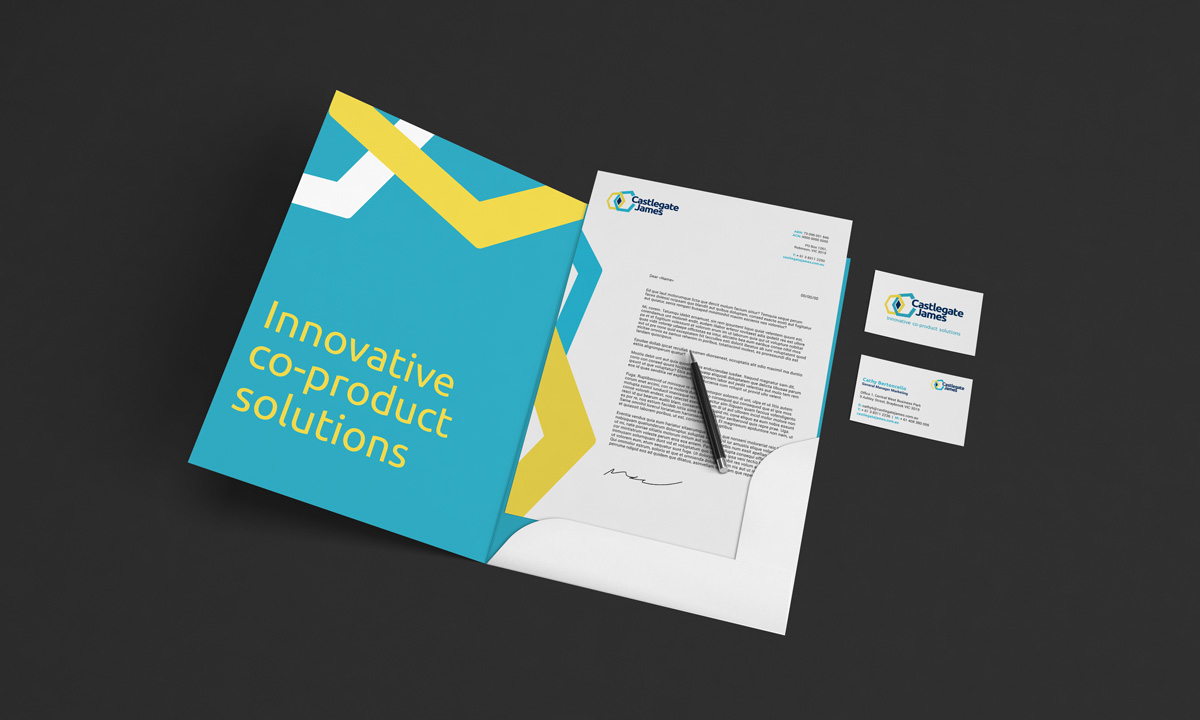
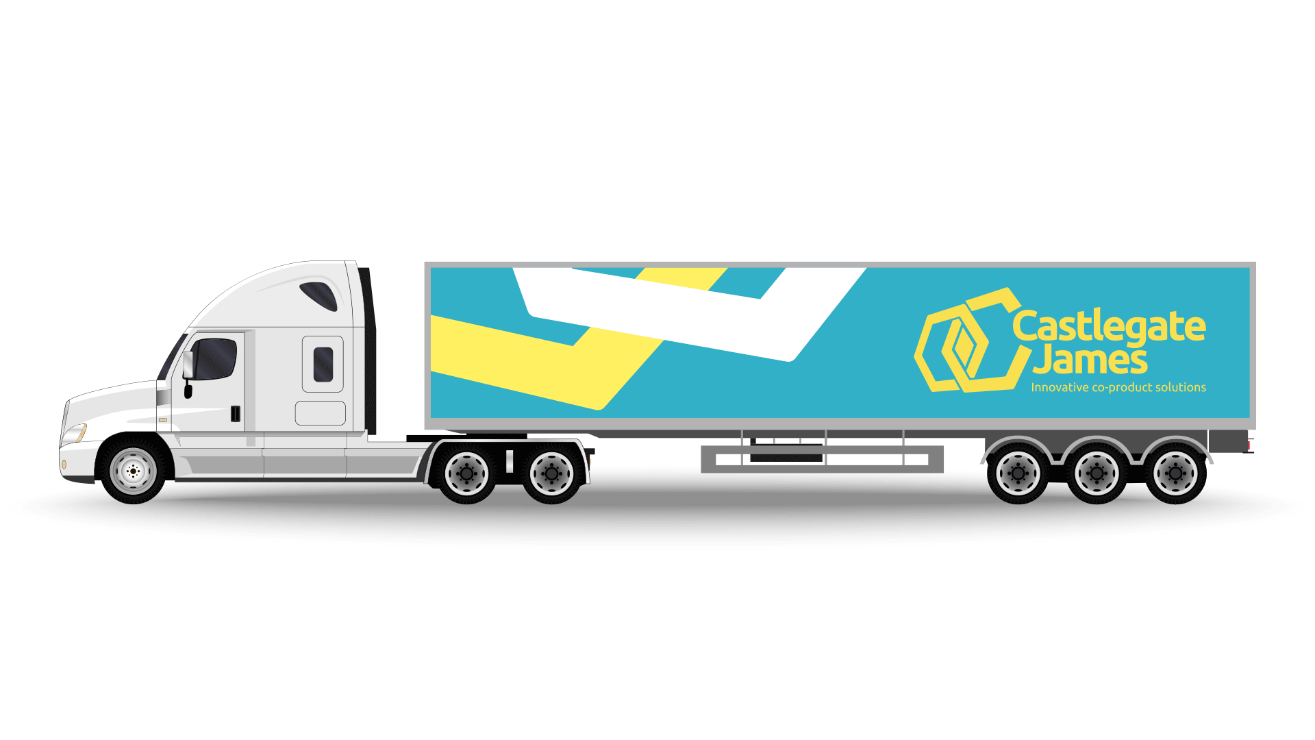
Client: Castlegate James
Studio: Zebra Direction
Role: Creative Direction, Development and Design

Repositioning a quiet leader in circular food systems

Castlegate James had a century of history, deep industry trust, and a uniquely sustainable business model. But its brand no longer reflected any of it. Best known as a manufacturer of stock feed, the company was operating far beyond that legacy. It was now a strategic partner for some of Australasia’s biggest FMCG brands, turning food-grade factory seconds into high-performance co-products for agriculture and beyond. In short, it was preventing waste before it became waste, long before most businesses even started talking about circularity.

The rebrand was not about disruption. It was about visibility. About making a deeply intelligent, purpose-led operation legible to the world and to itself.

Castlegate James is a leading Australasian company specialising in the transformation of food-grade excess, often perfectly edible products that fall outside commercial standards, into valuable co-products used across livestock, agriculture, and broader industry. Working with brands like Nestlé, Lion, and PepsiCo, they recover over 700,000 tonnes of material each year that would otherwise edge toward landfill. Their work is not only sustainable, but system-critical, quietly shaping a future where waste is designed out, not just dealt with.

Yet despite this innovative model, Castlegate James remained publicly anchored to its historical identity as a stock feed manufacturer. The disconnect was holding the company back, limiting how partners, regulators, and even staff saw their work. They needed a brand that matched their scale, values, and ambition.

The Challenge

The brief was clear: reposition Castlegate James from a traditional stock feed supplier to a leader in co-product food management. This was not just a cosmetic change, it was a strategic shift. The brand needed to signal trust and technical depth to agricultural clients, while also earning credibility with ESG-focused corporates and partners operating at the highest levels of the food system.

The core debate lay in the balance between legacy and leadership. How much should the new brand honour its roots, and how much should it signal a bold new direction?

Through continued client engagement the answer became clear. The past would be acknowledged in tone and narrative, but visually, the brand would step decisively into new territory.

Creative Solution

At the centre of the new identity is a brand mark built from two overlapping hexagons. A strong, complex shape found in nature, from beehives to snowflakes to crystal lattices, the hexagon is structurally perfect: stable, efficient, and inherently elegant. Its six equal sides allow it to tessellate without gaps, symbolising systems thinking and zero waste.

The dual, interlaced, hexagons speak to the collision of old and new, industrial and ecological, with their overlap revealing a diamond-like form. This hints at transformation under pressure. It is not decorative; it is a quiet metaphor for the company’s true work: revealing value in overlooked places.

A new tagline, “Innovative Co-product Solutions”, anchored the brand shift. Crucially, the term “co-product” replaced common language like “recycled” or “upcycled”, which carried connotations of waste. Castlegate James does not process waste. It intercepts perfectly usable material before it ever becomes waste. This shift in language was more than semantic. It redefined the company’s position in the supply chain and in the wider sustainability conversation.

The visual identity carried this same philosophy. A clean, precise palette combined with confident typography and generous space gave the brand a sense of intelligent calm. Gone were the earth-toned, utilitarian cues of stock feed marketing. This was a brand equally at home on a truck door, in a corporate boardroom, or across a digital sustainability report.

Implementation

The new identity was rolled out across:

  • Corporate stationery and internal communications

  • Vehicle livery and on-site signage

  • Packaging and product labelling

  • Sales tools and trade brochures

  • Social media channels and digital platforms

  • Branded workwear and merchandise

Each application served as a point of quiet reinforcement, turning everyday interactions into opportunities to reflect the business’s evolution. The updated tone of voice and visual language gave teams and stakeholders a unified way to speak about the company, its impact, and its future.

At the core of the transformation was the hexagon mark. It is simple, confident, and scalable. It became an instantly recognisable shorthand for the company’s evolution.

The supporting brand system was flexible and practical. It respected the operational complexity of the business, with multiple locations, diverse clients, and moving parts, while lifting the brand into a space of strategic authority.

Strategy and Tactics

The strategy focused on alignment, the brand had to resonate with:

  • Agricultural customers with long-standing relationships

  • Corporate partners seeking purpose-aligned suppliers

  • Regulators and ESG bodies focused on sustainability credentials

  • Internal teams seeking clarity and coherence

The rollout prioritised high-frequency touchpoints such as trucks, signage, uniforms, website, and social media. These channels became living proof points, ensuring that no matter where someone encountered Castlegate James, they saw the same story: a company with purpose and capability, ready for the future.

Outcomes

Internally, teams were equipped with tools and language that matched what they already knew: that this was a forward-facing business doing essential, impactful work. Messaging became more confident. External perception began to shift. The business now had the brand presence to match its role in the circular economy.

Perhaps most notably, the adoption of the term “co-product” helped Castlegate James differentiate itself from recyclers and end-stage processors. It now stood as a partner in upstream prevention and resource stewardship.

The rebrand gave Castlegate James a new platform. It provided internal alignment, external credibility, and a clear visual system that could flex across product lines, teams, and markets.

The company began to engage more confidently with sustainability partners, regulators, and industry bodies. It also laid the groundwork for future storytelling, recruitment, and ESG reporting. The brand was no longer trailing behind the business. It was leading from the front.

Key Takeaways

This project showed that design is not about decoration. It is about definition. When strategy, language, and identity align, they do not just tell a story. They reveal one that has always been there, waiting to be seen.