
Client: KMJ Family Law
Studio: Newpath
Role: Creative Director, Brand Strategy, Designer, UI Direction
KMJ Family Law approached me with low-fidelity UX wireframes and a brief to bring their new website to life. But during our early conversations, I realised there was a deeper opportunity. They were also exploring a rebrand and needed support in clarifying and aligning their identity. I proposed running the work in two streams, brand and website, which allowed us to move quickly while keeping strategy and execution tightly connected.
The Challenge
KMJ is not a typical law firm. Female-led, community-rooted and proudly inclusive, they act as both advocates and allies for clients navigating emotionally complex situations. Their values were clear in practice, but not yet visible in their visual or verbal identity. They needed more than a polished site. They needed a brand system that could express who they are and why they are different, in a way that felt both strong and approachable.
Approach
I ran the project in two parallel tracks.
Brand Strategy and Identity
I designed and facilitated a custom brand workshop that I had developed and refined over time. The session was structured to surface the firm’s brand story, positioning statement, mission, vision, values and tone of voice. It created space for the team to articulate what matters most to them and how they wanted clients to feel. These insights formed the foundation for the brand system and gave clear direction for visual and content development.
UX and UI Design
While the brand work progressed, I scaled up their original wireframes to mid-fidelity. This allowed the website structure and flow to evolve in parallel, so that by the time the identity was approved, I could move directly into UI design. Brand thinking and user experience were developed side by side, ensuring consistency across every touchpoint.
Creative Solution
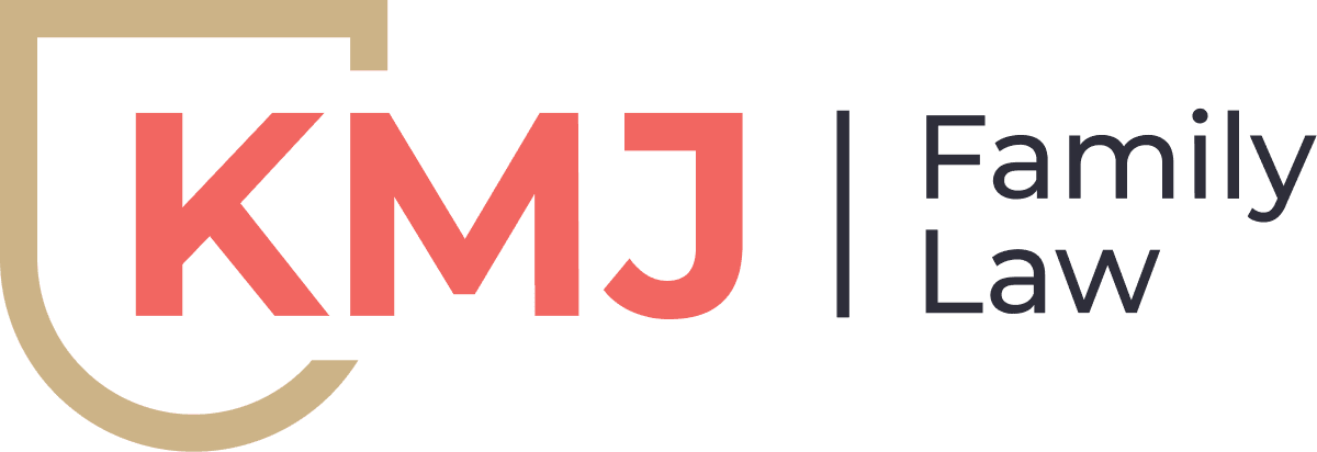
One idea shaped the entire visual identity: KMJ acts as a shield. Not a wall, but a source of strength and protection. The new logo centres around a stylised shield mark that conveys trust, advocacy and care. I kept the design modern and clean, ensuring it could flex across digital and physical applications.
I chose a typography system built on Montserrat and Assistant, balancing clarity with warmth. The colour palette was selected to feel calm and composed, avoiding the coldness often associated with legal branding. The brand story, tone and positioning that emerged from the workshop directly influenced content and interaction design across the site.
The website was designed to reduce stress and build trust. I prioritised clarity, open space and human tone. Every design decision, from page structure to microcopy, was made with the user’s emotional state in mind. The shield mark was used with restraint, building recognition without dominance. Calls to action were written in plain language, encouraging users to move forward with confidence.
I treated every detail as part of the brand system. Nothing was decorative. Everything had a purpose and reinforced the values we had uncovered.
Deliverables
-
Brand workshop (designed and facilitated by me)
-
Logo suite (horizontal, stacked, icon-only)
-
Brand guidelines
-
Brand story, tone of voice and positioning documentation
-
Responsive website
-
UI system including typography, colour, layout and interaction design
-
Art direction and guidance for photography and copy
Results
KMJ launched with a renewed sense of identity that felt unmistakably theirs. The brand gave them language to express who they are and visuals that matched how they work. The website became a key channel for connection and trust-building, especially for new clients.
Internally, the team felt seen. Externally, the response was immediate. Clients and peers commented on the clarity, warmth and distinctiveness of the new identity.
This project reinforced the importance of listening early and building tools that reveal, rather than impose, a brand’s story. By leading with a strategic workshop and running brand and digital work together, I was able to deliver something that was not only visually strong but emotionally resonant. KMJ’s new identity gives them space to grow while staying true to their values and voice.