Client: Heritage Seeds/Barenbrug
Studio: Zebra Direction
Role: Art Direction, Graphic Design
Designed to Be Trusted: Turning a Seed Catalogue into a Field-Ready Tool
Designing Heritage Seeds’ field guide meant creating more than just a product catalogue, it was about crafting a working tool for Australian producers. As Art Director and Designer, my role was to turn an abundance of technical, agronomic content into a format that could live comfortably in a back pocket, survive the cab of a tractor, and deliver clear, immediate value where and when it was needed most.
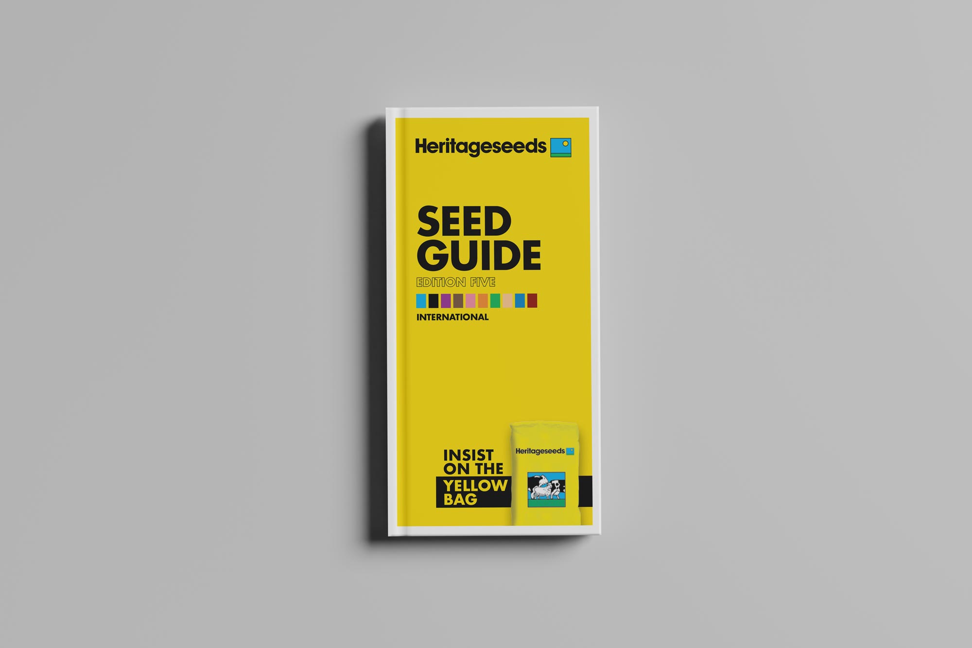
The guide needed to act like a pocket-sized agronomist, offering practical insight on planting windows, growth cycles, and soil requirements, especially in rural areas where internet access might be patchy or nonexistent. The DL-sized format was non-negotiable, optimised for portability, but it introduced a major challenge: compressing and structuring dense, vital content into a tool that wouldn’t overwhelm or frustrate the reader.
The solution lay in clarity, pace, and a fast, intuitive navigation system. I developed a colour-coded structure with visible edge tabs so producers could locate sections at a glance, transforming the booklet into a tactile, quick-reference resource. Information design was pushed to the fore: grids, hierarchy, and carefully managed space made complex data accessible without visual clutter, even in tough light or mid-task moments.
What began as a print asset evolved into something more impactful. The final product didn’t just support Heritage Seeds’ commercial goals, it became an everyday companion in the field. It was practical, trusted, and widely used by both producers and sales teams alike. More than that, it became a tangible expression of the Heritage Seeds and Barenbrug Australia brand promise, directly aligning with their pillars where product knowledge and trusted advice intersect. The guide helped demonstrate that this wasn’t just a company selling seed, it was a partner in production. A quiet, hard-working design that embedded itself into the daily routines of its audience and helped build long-term loyalty from the ground up
Designing for Dust and Decisions
A field-first seed guide that’s as useful as the product it promotes
Barenbrug Australia (formerly Heritage Seeds) needed something deceptively simple: a printed guide to their pasture and forage seed range. It had to show the breadth of their offering, provide enough agronomic detail to support decision-making, and be easy enough to use in the cab of a ute, in the paddock, or mid-conversation with a rep. But the underlying challenge was far from straightforward.
I was brought on as Art Director and Lead Designer to help shape the piece into something much more than a catalogue. This needed to be a genuinely useful tool for agricultural producers and agronomists, people making decisions where internet access is unreliable and time is short. The guide had to fit their environment, both physically and cognitively. That meant compact, fast to navigate, and packed with information that wouldn’t overwhelm.
We settled on a DL format, chosen for its portability, it fits in a pocket, a glovebox, or a folder without folding. But this introduced the first big tension: how do you fit so much information into such a tight space without sacrificing clarity?
There was no room for decorative excess. Every layout decision had to serve the content. I worked through multiple iterations to establish a clean, compact visual system, optimising for legibility, hierarchy, and fast scanning. Tables were refined to minimise visual noise. Fonts and spacing were tested across actual field printouts. I collaborated closely with the client team to understand what details were essential, what could be reduced or grouped, and how to visually represent agronomic guidance without clutter.
To aid navigation, I developed a colour-coded tab system visible from the edge of the closed booklet, allowing readers to instantly locate key seed types, ryegrasses, legumes, cereals, and more. It’s a simple but effective cue designed around real usage: you can see where to turn, even with dusty fingers or while bouncing in a tractor cab.
What made this piece truly work was how well it aligned with Barenbrug’s brand promise: high-performing product, backed by deep agronomic advice. This wasn’t a sales brochure. It was a working tool, reflecting the same care and expertise as the seeds themselves. That strategic brand alignment, design as a conduit for trust and knowledge, was intentional throughout.
In the end, what stays with me isn’t just the finished guide. It’s the rigour it demanded: the discipline of fitting so much into so little, without ever tipping into overload. The final piece is dense but clear, compact but comprehensive. It doesn’t just reflect the brand, it works hard in the hands of its users, which is exactly where it belongs.

