Client: ACSO
Studio: Newpath
Roll: HCD Consultant / UX Designer
Designing the digital backbone of care for vulnerable Australians
Overview
When ACSO, the Australian Community Support Organisation, set out to replace its paper-based systems, it wasn’t just a tech upgrade. It was a foundational shift in how the organisation supported some of the most vulnerable people in society, those transitioning from the justice system into community care.
They needed a centralised, intuitive platform to manage both client journeys and facility operations. It had to be clear, compliant, and scalable, serving as a digital bridge between high-stakes human needs and complex internal processes.
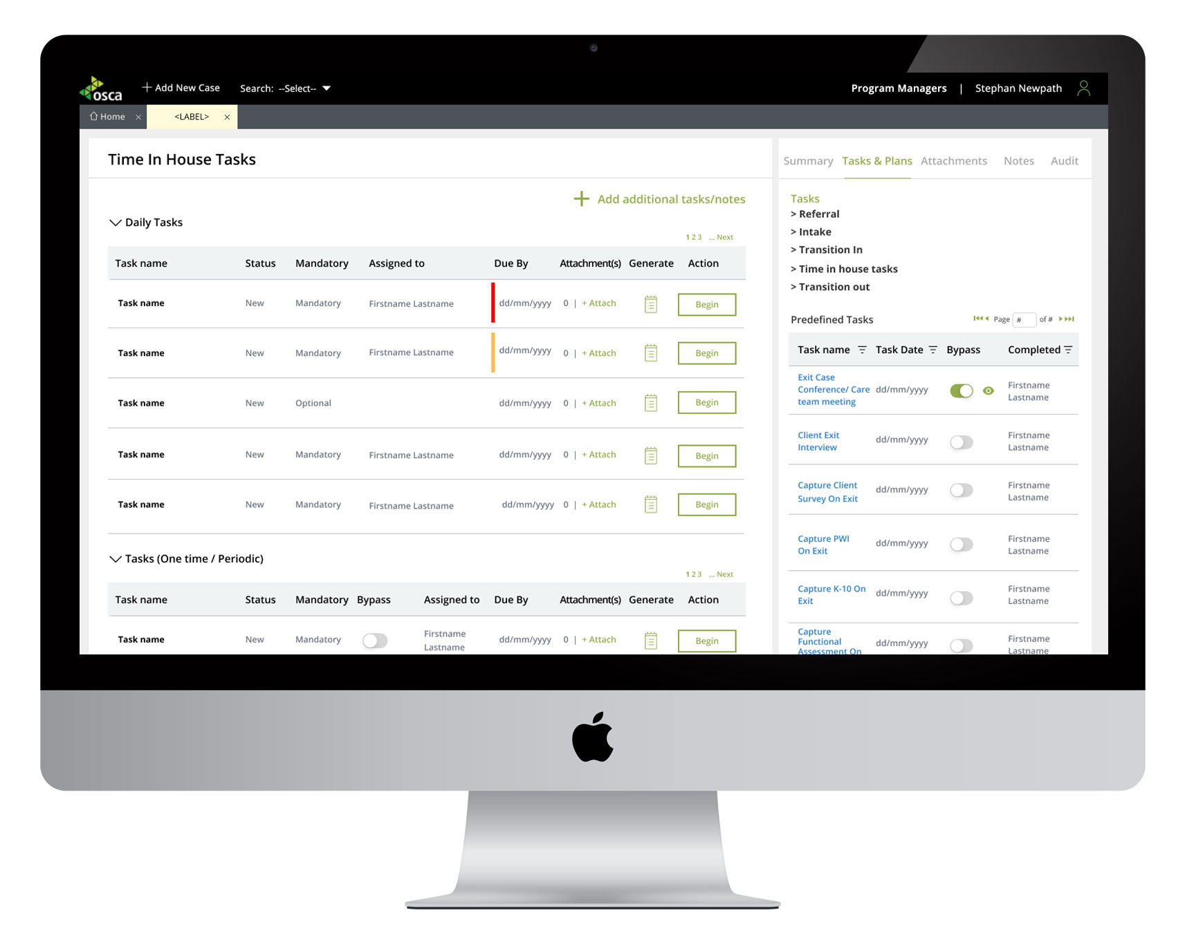
I joined the team as a UX and product consultant to help shape that system. Working from within the delivery team, I designed over 75 workflows and more than 350 final screens, each one balancing user empathy, compliance demands, and the constraints of the PEGA platform.
Context and Challenge
ACSO operates in a space where timing, clarity, and care continuity can mean everything. Their staff, including case workers, program leads, and facility coordinators, handle sensitive information, make urgent decisions, and work with people in vulnerable life moments. But the tools they relied on hadn’t kept up.
At the time, most processes were still handled manually, through paper forms, Word templates, emails, and memory. Case notes could be lost or delayed. Handover between teams lacked structure. Regulatory reporting was cumbersome. And as the organisation scaled, these gaps became risk factors.
The challenge was to create a digital system that could replace these manual processes while preserving the nuance and flexibility required in care work.
It needed to support detailed, timestamped documentation, streamline daily tasks without oversimplifying, be intuitive for a wide range of users, work entirely within the limitations of PEGA’s component-based structure, and become the operational spine of ACSO’s future growth.
My Role
As the embedded UX consultant, I was responsible for bringing cohesion and usability to a sprawling, high-stakes product. That included mapping and designing over 75 user journeys, building an evolving design system in Figma, prototyping live during workshops, collaborating daily with business analysts, developers, and stakeholders, and advocating for users while navigating technical and compliance constraints.
The work was delivered in sprints, often with shifting scope and mid-session problem-solving. It was hands-on, high-touch, and deeply collaborative.
Constraints and Complexities
This project brought a number of constraints, each one shaping the design approach.
The platform itself, PEGA, offered limited flexibility. Its interaction model relies heavily on popup modules that don’t allow back-and-forth navigation. For example, once a user moved from one popup to another, they couldn’t return to the original state. This affected how we sequenced information, grouped tasks, and managed state transitions. In many cases, we had to rethink the user journey entirely to work within this limitation.
The system was being designed for staff with a wide range of digital experience. Some users were tech-savvy, while others had minimal exposure to digital tools. Interfaces had to be clean, direct, and self-explanatory. Tooltips, field labels, and copy all needed to do heavy lifting without overwhelming.
The scope was ambitious, covering more than 75 user flows across different program types and operational domains. Each one had its own logic, exceptions, and compliance requirements. It was essential to create consistency across these journeys so that users didn’t feel like they were jumping between unrelated systems.
Regulatory compliance was non-negotiable. Every entry, update, and decision needed to be timestamped, attributable, and auditable. This added another layer of design consideration, particularly when working with sensitive or high-risk data.
Approach
Workshops formed the backbone of the design process. These weren’t just stakeholder check-ins, they were working sessions that included frontline representatives from the user groups. By designing in real time and presenting flows as they emerged, we were able to validate logic, spot issues early, and align features with the realities of day-to-day care work.
We approached the 75 flows in clusters, starting with the most frequently used or highest risk. This phased approach allowed us to focus on depth over breadth, while still building reusable patterns for future workflows.
Instead of building a complete design system from day one, I developed it progressively. As each new flow was designed, I pulled recurring components into a shared Figma library. Form layouts, status banners, action buttons, and data panels all began to emerge as consistent, reusable elements. This made later stages of the design work significantly faster, and also gave the team a familiar visual language to work from.
I also designed and iterated live. Where possible, rather than taking workshop feedback away and returning with revised mockups days later, I made changes on the spot. This sped up decision-making and helped stakeholders better understand the nuances of the system they were shaping. It also allowed for rapid exploration of alternatives when we hit technical limits.
Key UX Decisions
Throughout the project, I worked to reduce unnecessary friction in the interface by challenging the team to consider whether tasks could be completed with fewer steps. Where I saw related functions spread across multiple screens, I would suggest combining them to create streamlined experiences and reduce user frustration.
Another area I pushed on consistently was microcopy. System-generated language or placeholder labels often lacked clarity or precision. I worked to rewrite them in ways that reflected user intent and gave reassurance about what would happen next. A simple button change from “Submit” to “Send for Approval” might seem small, but for users working under pressure, the difference in confidence is significant.
Perhaps the most complex challenge was navigating PEGA’s limitations. The inability to chain popup modules meant we couldn’t rely on familiar modal patterns. Instead, I worked closely with PEGA specialists to restructure the logic of several journeys. In some cases, this meant shifting tasks to full-page views. In others, it meant changing the order in which actions were presented to prevent users from being locked out of a critical step. These were quiet but crucial design decisions that made the system feel stable and trustworthy.
The Solution
The system we built together supported a wide variety of interconnected tasks, including:
-
Client overview dashboards showing real-time case progress, flags, and outcomes
-
Transition planning tools, from entry to re-entry and aftercare
-
Task assignment and tracking features for program leads and case workers
-
Facility management interfaces covering bed assignments, equipment access, and visitor logs
-
Medication and risk flag tracking for residential clients
-
Custom workflows for generating audit reports and regulatory documentation
-
Flexible form generation tools for program-specific assessments and plans
All screens were delivered in Figma, structured using the evolving component library, and reviewed against PEGA’s constraints to ensure feasibility.
Outcomes
This wasn’t the kind of project that would be measured by traditional metrics like adoption rates or user growth. Every staff member was required to make the switch, and the real measure of success was how easily they could do that without disruption.
What changed was significant. Paper forms and manual processes were replaced with structured digital flows. Staff could access client information faster, handovers became clearer, and internal communication improved. Notes were logged in real time, with timestamps and authorship built in, creating a reliable record that supported both care quality and regulatory obligations.
The team at ACSO were highly satisfied with the end result. They valued not only the final product but also the clarity, speed, and strategic insight I brought to the design process.
Reflection
This project reinforced for me that good design doesn’t always announce itself. Sometimes it’s the quiet confidence of a tool that just works, especially when lives and wellbeing are in the balance.
It also reminded me that constraints, when approached with the right mindset, can drive smarter, more intentional decisions. Working within a rigid platform like PEGA challenged me to be both creative and pragmatic. And collaborating directly with the people who would use the system helped ensure we built something that felt grounded, not abstract.
This was infrastructure that mattered. And I’m proud to have helped make it more usable, more human, and more resilient.